For this project I used the tutorial our wonderful teacher Dennis posted to create a sketch like image. I used the first photo, a picture of my best friend, and the second, a photo of Angelia Jolie. I think the second one turned out better, but I figured I would post both. I experimented with using the Gaussian blur as well as creating multiple layers and what to do to manipulate those layers. I thought this was a really cool project!
Thursday, February 27, 2014
Filter
For this project I experimented with the filter effects as well as channels. I used the movie effects in hopes of creating a movie-esq poster photo. Taking the color of the bandana to create the more playful text "We can do it!" finished this bad boy, or should I say girl, off!
Bitmap
This was my first project in photoshop! I first changed everything to black and white, then changed it to Bitmap. I then selected the white and created a red to blue gradient. After this I colored my lips and cheeks red as well as changing the color of my bandana from red (original color) to blue to add more contrast. Adding the famous words of Rosie the Riveter "We can do it!" completed the piece.
Monday, February 24, 2014
Hierarchy 2
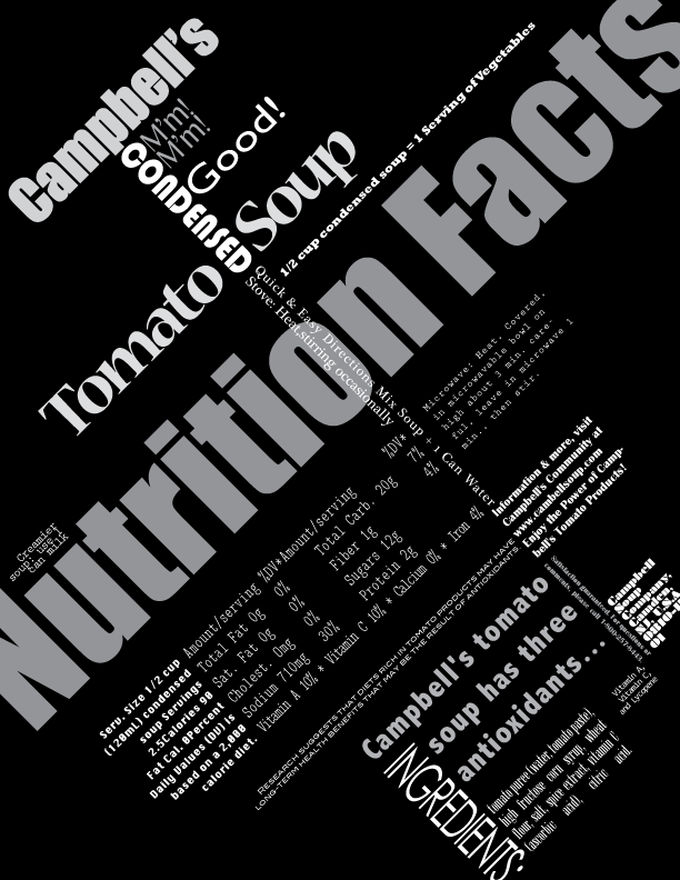
 Similarly to the first phase of the project, I used words from a Campbell's soup can to create a more dynamic piece. I used various fonts and chose to have an alignment on a 45 degree angle! This was my first time designing anything on an angle and found it to be challenging. I initially had incorporated red into this piece but found that it made it too busy. Instead I chose to use different shades of grey to give the words more dimension. I "broke the rules" for this project by letting some words run off the page. Though it may not be a best practice, I enjoyed experimenting!
 Hierarchy 1
For this project we took the words from a Campbell's Soup can. I tried to create a simple, but interesting grid alignment that focused on the contrast of black and white as well as right alignment. I used one font, Optima, which I think added to the simplicity of it.
Thursday, February 13, 2014
Cohesive Form 3
For this project I took my graphic of my initials and created a business card. None of the information on the card is real so don't even think about talking me! What I like about this is how I used the gradient and white space to create the N in my name.
Thursday, February 6, 2014
Cohesive Form 2
These are my initials which I mushed together to create one form. I am proud of the geometry in this project. Some special things to note in the this project is the alignment of the top of the "J" to the middle of the F", the width of the "J" and "F" are the same, and the contrast of the gradient to the "N". I had a lot of fun with this project and getting better at alignment and positioning among negative/positive space.
Cohesive Form 1
"jF" are my initials. I created one form out of these two letters focusing on contrasting the fonts and position on the page.
Tuesday, February 4, 2014
Compositional Design Units 3
This creation explores color, geometry, as well as typography. I also incorporated a photo of myself in the bottom right hand corner. Though Dennis finds this image a little scary, I like how it blends in very well to my overall photo.
Compositional Design Units 2
This piece explored the use of typography. I created different shapes by overlapping text, making text different sizes, shifting the orientation, and changing the spacing between the letters. The use of only black and white contrasts the business of the letters. My favorite moments in this piece is the "TNAX" against the black block because the letters flow naturally into the white space, as well as the cursive "B" in the top right hand corner.
Subscribe to:
Comments (Atom)


