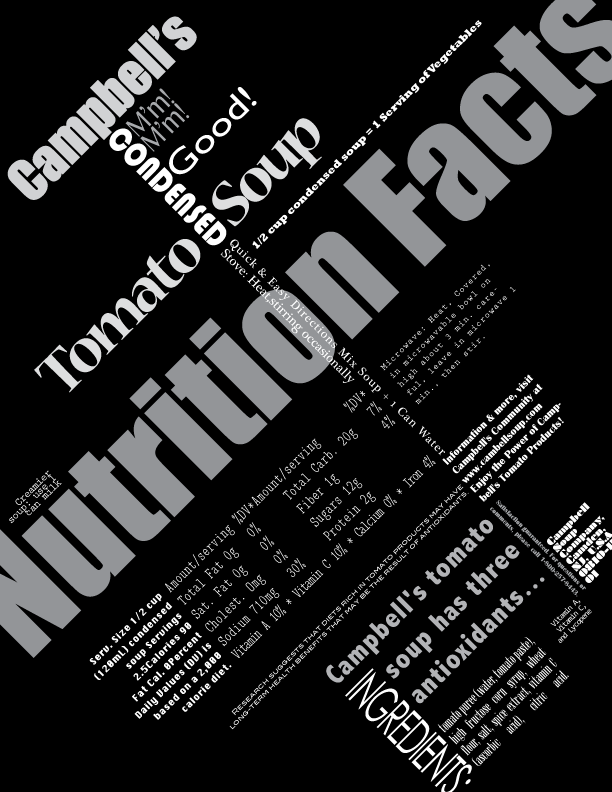
 Similarly to the first phase of the project, I used words from a Campbell's soup can to create a more dynamic piece. I used various fonts and chose to have an alignment on a 45 degree angle! This was my first time designing anything on an angle and found it to be challenging. I initially had incorporated red into this piece but found that it made it too busy. Instead I chose to use different shades of grey to give the words more dimension. I "broke the rules" for this project by letting some words run off the page. Though it may not be a best practice, I enjoyed experimenting!
 Monday, February 24, 2014
Hierarchy 2
Similarly to the first phase of the project, I used words from a Campbell's soup can to create a more dynamic piece. I used various fonts and chose to have an alignment on a 45 degree angle! This was my first time designing anything on an angle and found it to be challenging. I initially had incorporated red into this piece but found that it made it too busy. Instead I chose to use different shades of grey to give the words more dimension. I "broke the rules" for this project by letting some words run off the page. Though it may not be a best practice, I enjoyed experimenting!
Subscribe to:
Post Comments (Atom)
No comments:
Post a Comment